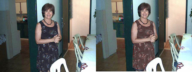
Very Dark Areas

If any difficulty exists at all in transforming the colours of pictures, it is in connection with dark areas. What appears to be pure black of a single hue may turn out to have an invisible underlying structure of lots of colours. It depends on how the picture was made and previously saved in the computer. So if you make a dark area much lighter, it will actually create new forms that do not make sense within the context of the whole picture. Nor will it look convincing. A nitid photo with areas showing a poster effect is generally disagreeable. So in general, do not attempt to lighten dark areas too much. You need to learn what you can do and what you cannot do with a dark area.
In the example above, I used Cutout 2 again, first to make the dress a little lighter relatively, and then again to change the absolute value of the hue. (The cutout tool was used in 2 bites, without any use of the zoom.) Then I lightened the table cloth and the side of the kitchen cupboard. Note that the kitchen cupboard is just on the threshold of becoming unconvincing, i.e. it has a slight poster effect.